← Back to portfolio
MAKSIMS / WEB REDESIGN01 / 08

From a company profile
to a clear enquiry path.

An accounting website redesign:
structure, visual identity
and a quote request form.
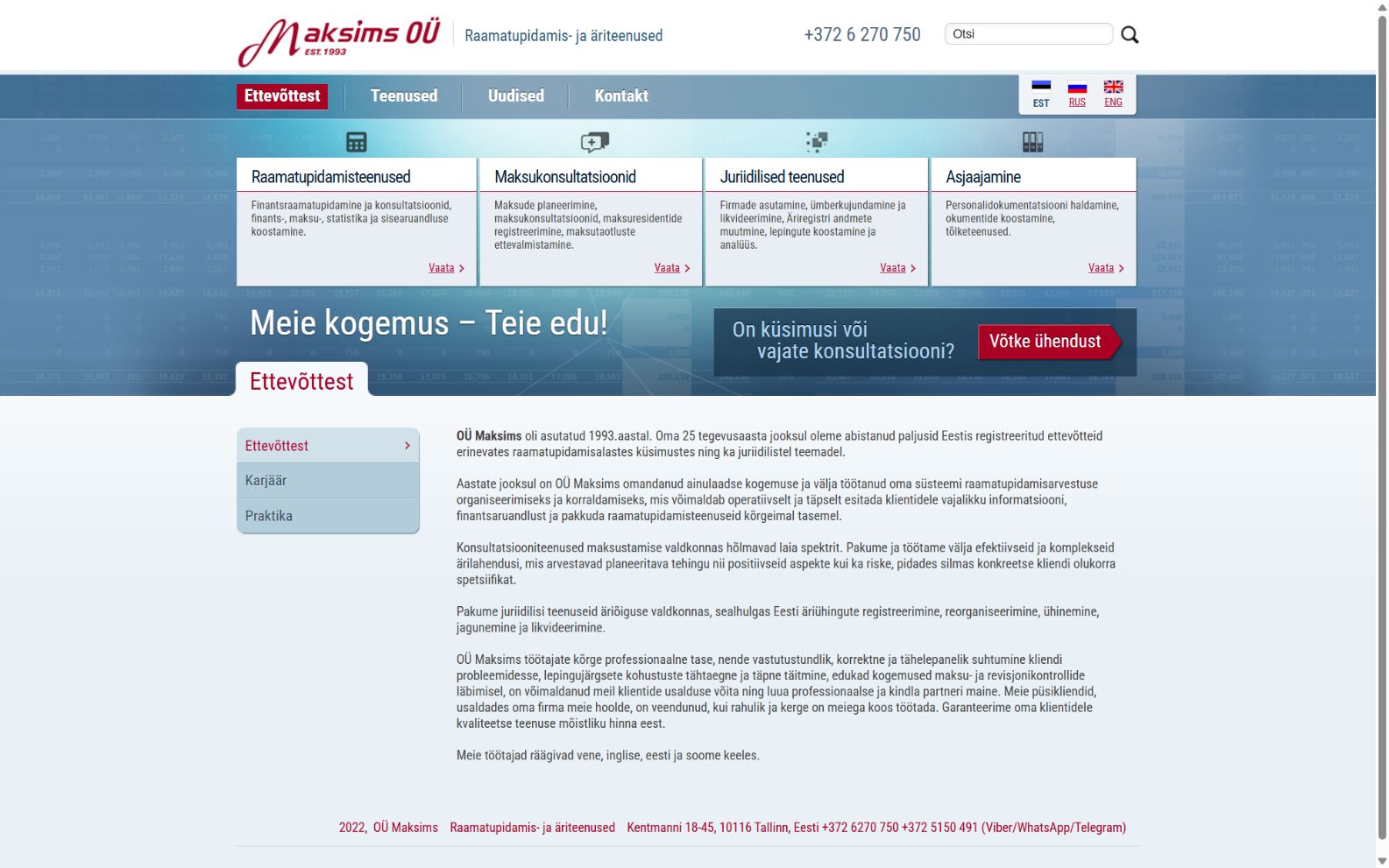
BEFOREmaksims.ee
Original Maksims homepage with blue navigation and a long company introduction
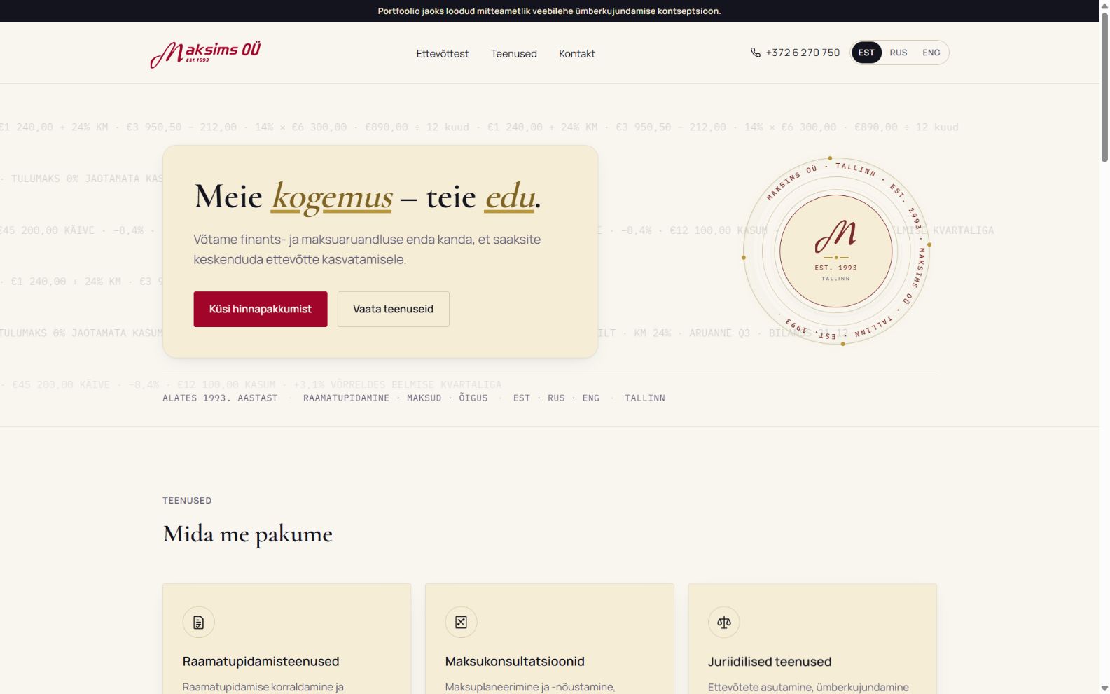
AFTERmaksims.tolstouhhova.ee
Redesigned homepage with a service introduction and quote request button
Independent portfolio concept · not commissioned by Maksims OÜWhat changed in the client journey? →
MAKSIMS / STRUCTURE02 / 08
START WITH THE CLIENT’S TASK

A clear
next step.

The first screen introduces the service and an action, instead of a long company introduction.

  • Services and who they are for.
  • How it works and common questions.
  • A quote request alongside the services.
AFTER / FIRST SCREEN
Redesigned homepage with quote and services buttons

Two clear paths: explore services
or request a quote.

Independent portfolio concept · not commissioned by Maksims OÜThe biggest change is in the form →
MAKSIMS / BEFORE03 / 08
THE COST OF GETTING IN TOUCH

17 questions.
12 marked
as required.

The original form asks for exact figures and company details before the first conversation.

To ask about a price,
first gather the numbers.

Counts are based on the published form.
“Required” refers to its visible markings.
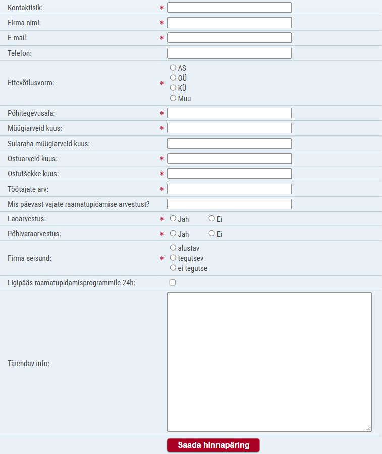
BEFORE / COMPLETE FORM
Original form with 17 questions about contacts, invoices and accounting
Independent portfolio concept · not commissioned by Maksims OÜWhat do we really need to know first? →
MAKSIMS / RETHINKING THE FORM04 / 08
LESS EFFORT TO ANSWER

Three figures.
One range.

Sales invoices, purchase invoices and receipts become one estimate of monthly documents.

Up to 20 / 21–50 / 51–100 / 100+

Large options make selection straightforward. The whole second step is optional: details can wait until the conversation.
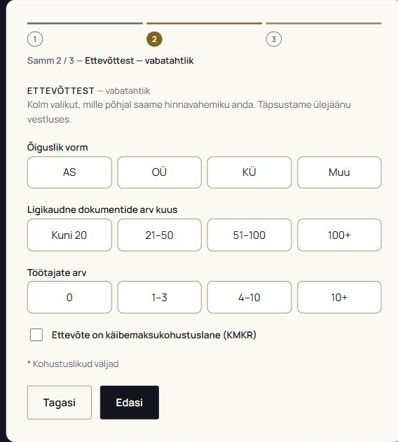
AFTER / STEP 2 — OPTIONAL
Optional second step with company type, document range, employees and VAT
Independent portfolio concept · not commissioned by Maksims OÜHow much is required to get started? →
MAKSIMS / CONTACT FIRST05 / 08
LOWER THE INITIAL EFFORT

Two fields
to start
a conversation.

Name or company name and email are required. The phone number is optional.

First, a way to get in touch.
Then, the details of the task.

Consent to data processing is also required
before the final action.
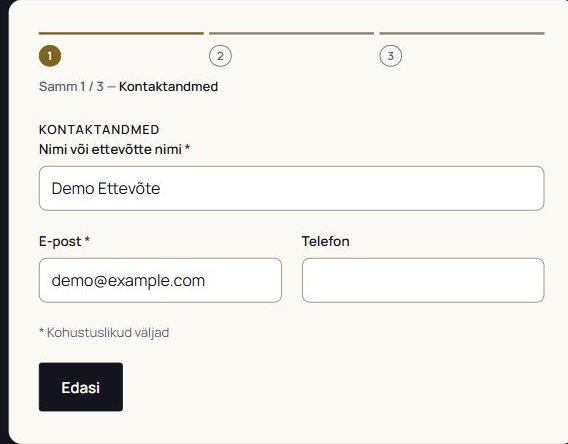
AFTER / STEP 1 — CONTACT DETAILS
First step with Demo Ettevõte, demo@example.com and an empty optional phone field
Independent portfolio concept · not commissioned by Maksims OÜHow can visitors check their answers? →
MAKSIMS / REVIEW BEFORE SENDING06 / 08
A TRANSPARENT FINAL STEP

Review.
Refine.
Confirm.

The third step shows every answer. Skipped fields are labelled “täitmata” — “not filled in”.

  • Go back to correct details.
  • Optional answers do not block progress.
  • Consent links to the privacy policy.

The screenshot contains test data only.
The published form runs in demo mode.
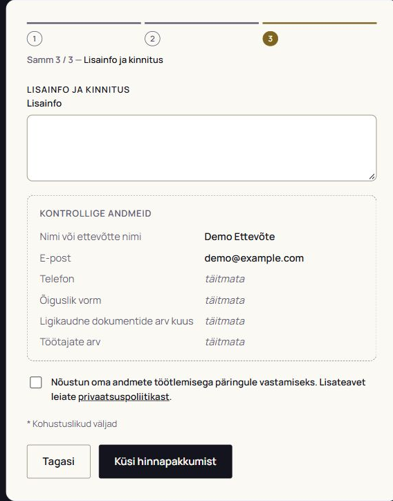
AFTER / STEP 3 — REVIEW
Review step with test contacts, skipped fields and data processing consent
Independent portfolio concept · not commissioned by Maksims OÜWhat does the website look like on a phone? →
MAKSIMS / ON MOBILE07 / 08
THE SAME PATH ON A PHONE

The service.
The next step.
Within reach.

The first screen explains the service and offers two actions: request a quote or explore services.

  • Buttons stack vertically.
  • Navigation sits in a compact menu.
  • Language selection stays in the header.

Actual screen of the published concept.
390 px viewport · 12 October 2026.
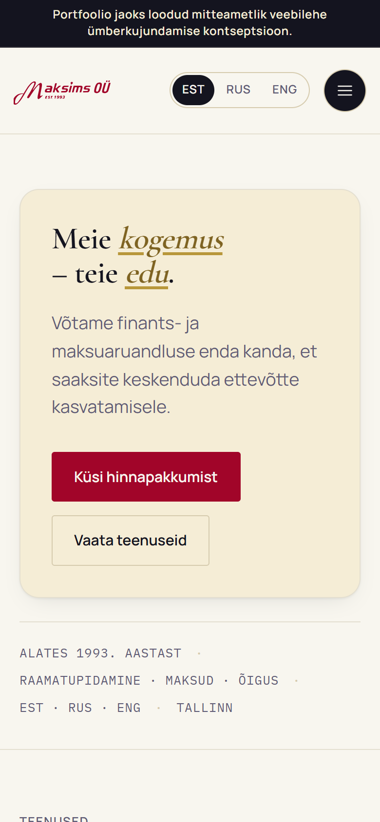
AFTER / MOBILE HOMEPAGE
Mobile Maksims homepage with language selection, compact menu, quote and services buttons
Independent portfolio concept · not commissioned by Maksims OÜWhat if a form is not the right fit? →
MAKSIMS / OUTCOME08 / 08
LET PEOPLE CHOOSE

A form is
one way
to reach out.

Above the form, visitors can choose to call or write instead — whichever channel suits them.

The redesign’s outcome:
a clear path from service to contact.

The aim is to reduce enquiry effort.
Impact on enquiries has not been measured.
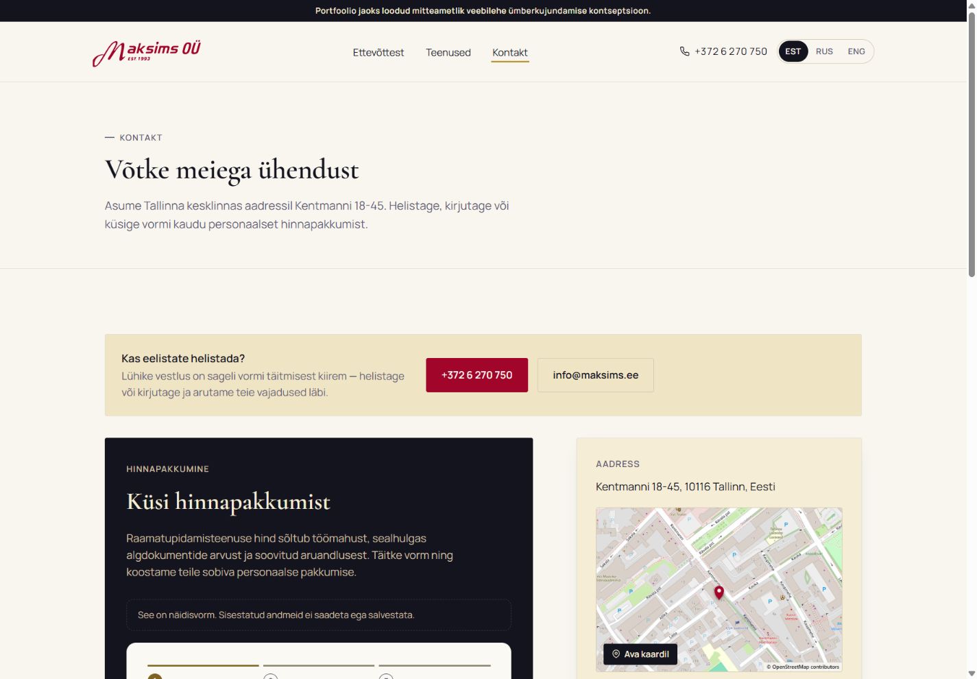
Explore the concept ↗
AFTER / AN ALTERNATIVE TO THE FORM
Contact page offering a phone call or email above the quote form

“Prefer to call?”
A short conversation can be quicker than a form.

Independent portfolio concept · not commissioned by Maksims OÜStructure + interface + form logic
Screenshots: 12 October 2026 · Original website · Redesign concept